flip’d by IHOP
Creating a brand from the ground up. From establishing the tone and brand characteristics, to defining the visual identity, customer experience and designing the physical space.
-
Branding
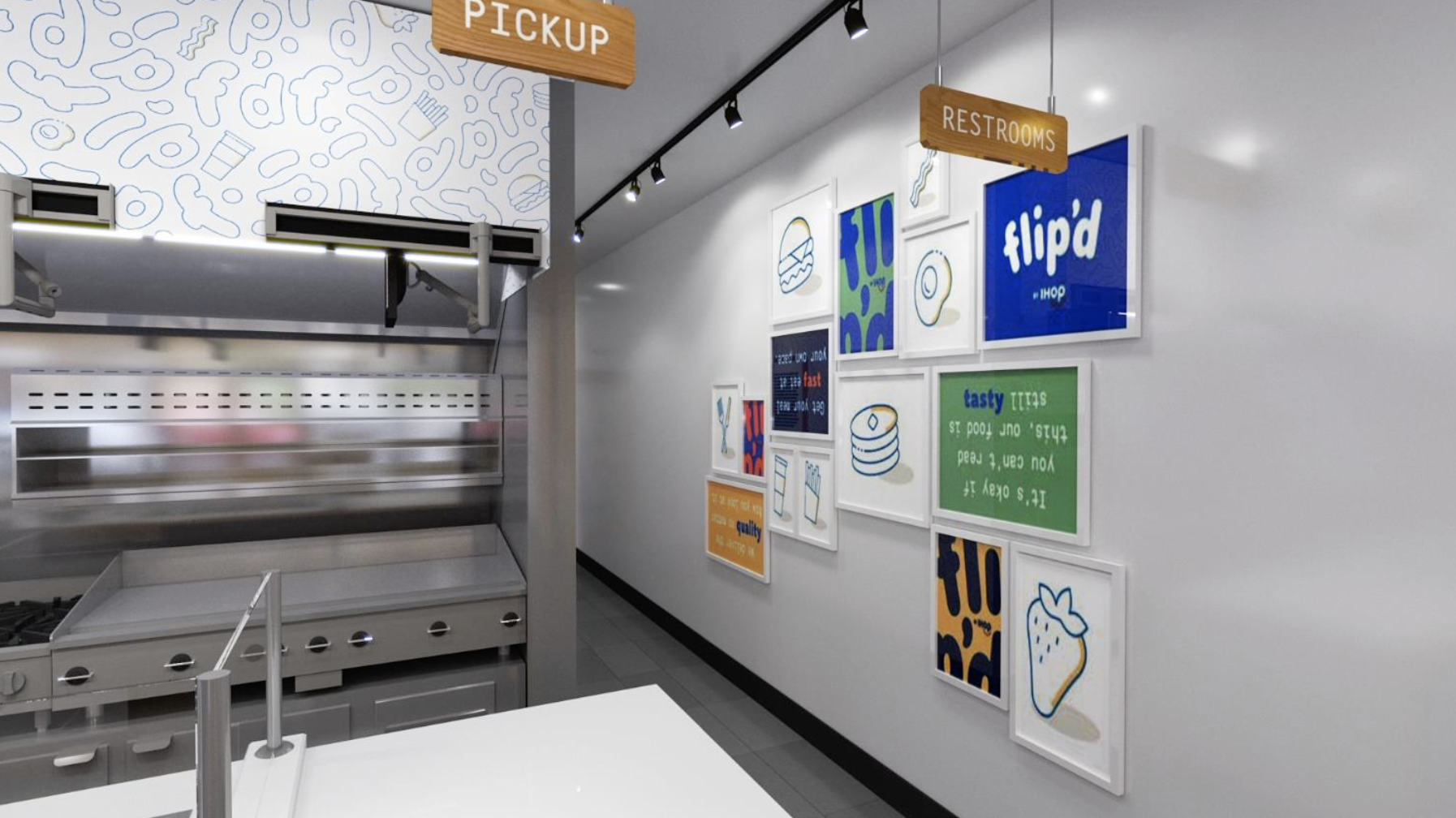
From designing the logo and establishing the color palette and typography, to creating a custom pattern, icons and graphic elements, we had the opportunity to set the rules and visually communicate what flip’d stands for.
Visual System
The system is modular: one that is flexible and can easily change, similar to the nature of flip’d.
-
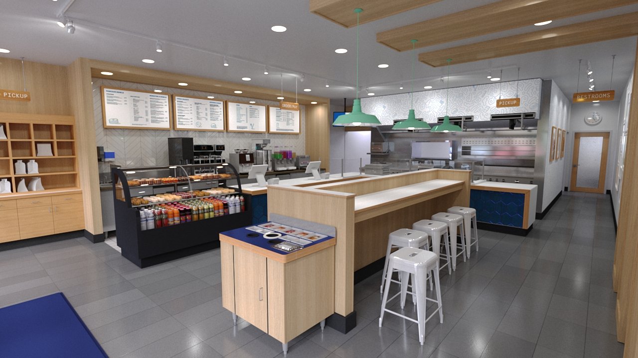
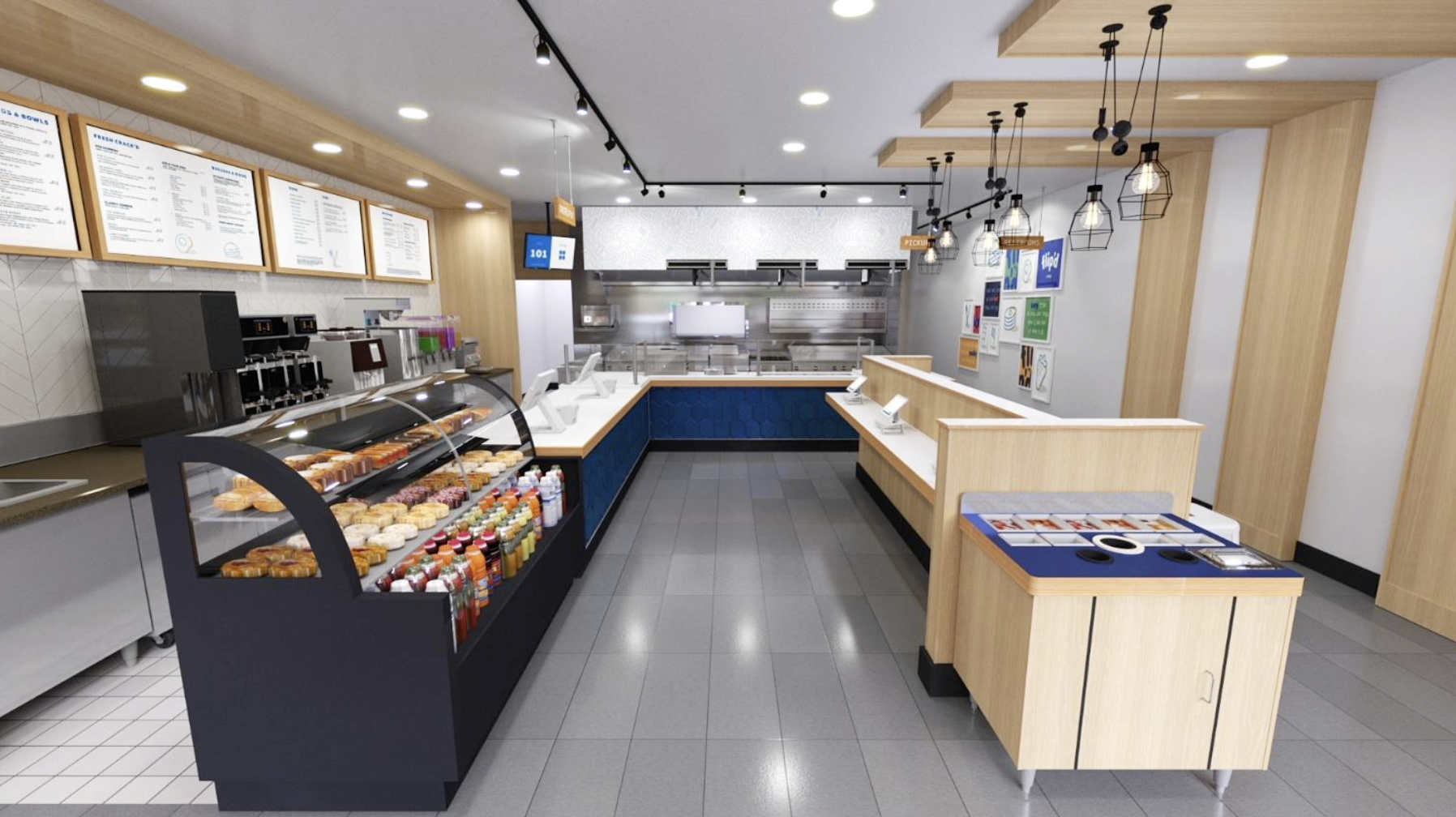
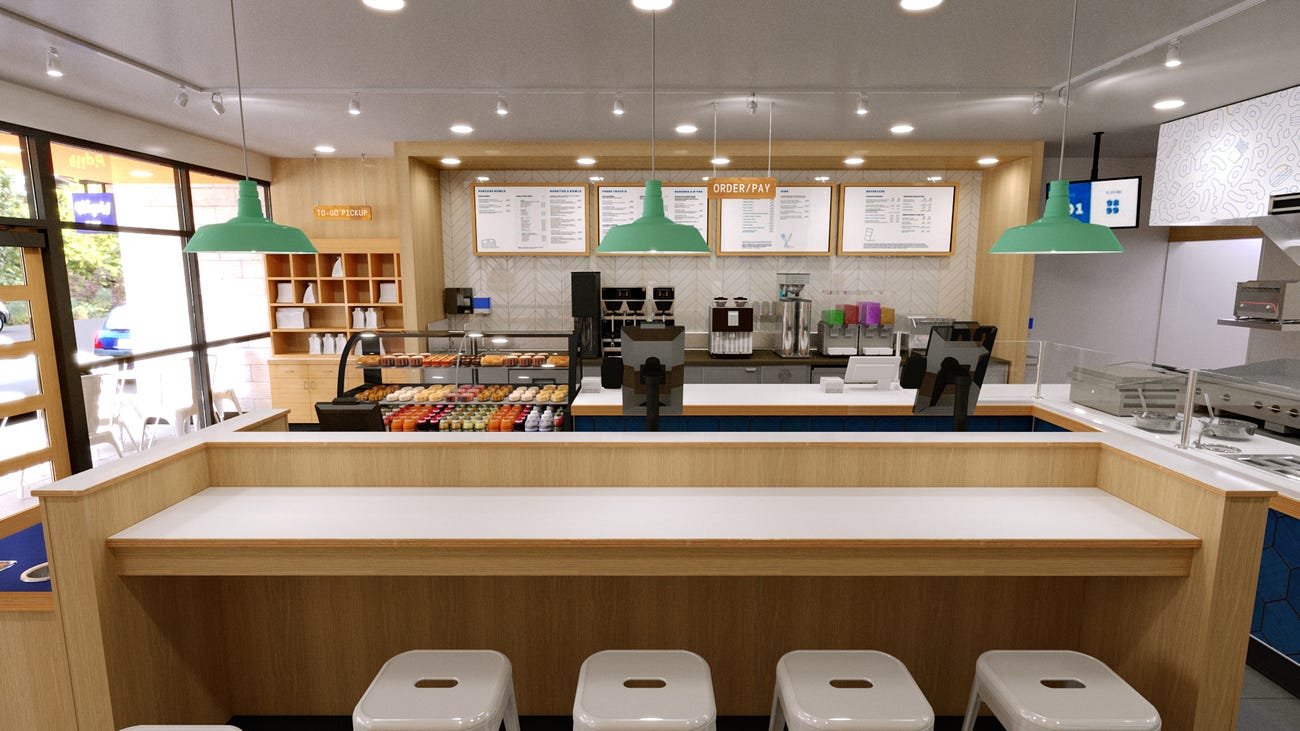
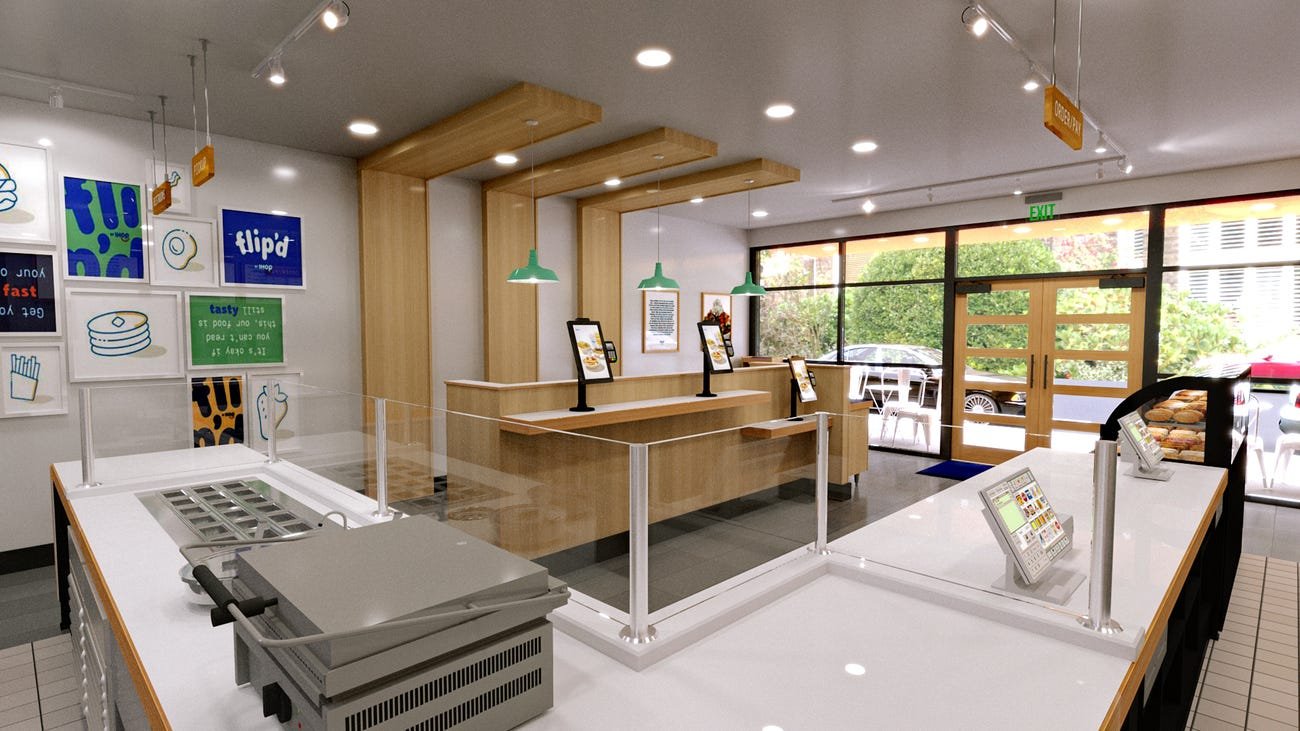
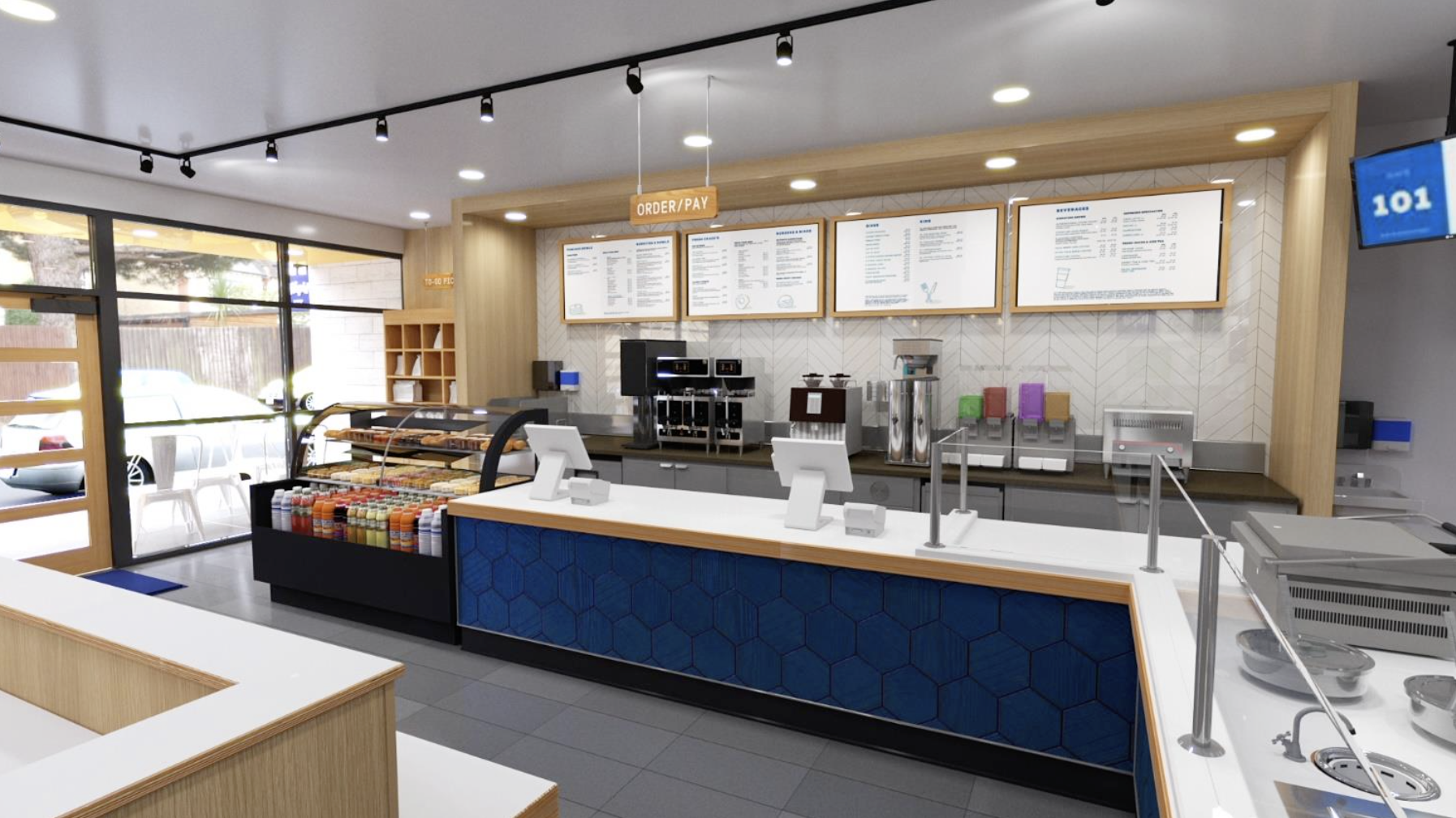
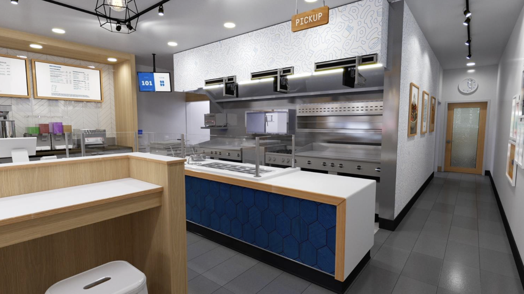
We worked to not only design the interior of the store, but also established the customer journey and experience. From entering the store, to ordering food and picking up your order, we had a hand in ensuring the overall flow within the space was seamless.
Materials
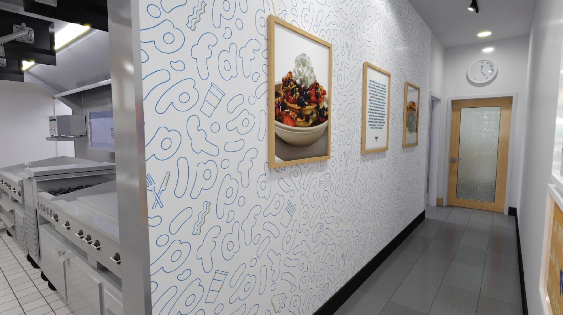
From wood tones and tiles, to lighting, seating, custom wallpaper and more, everything was chosen in an effort to create an environment that felt fresh and modern, but also inviting and fun.
Physical Elements
Our customized clock, gallery wall, uniforms and packaging, menu boards and to-go menus were all designed with the brand tone and feel in mind.
-
Design - Olivia Piazza, Rich Greco
Brand Development - Olivia Piazza, Rich Greco
Creative Direction - Olivia Piazza, Rich Greco
-


